
Websites that work as hard as your brand
Custom, responsive websites designed for performance, accessibility, and conversion — built to grow with your business.
01 / Selected work
Different stories.
The same eye for detail.
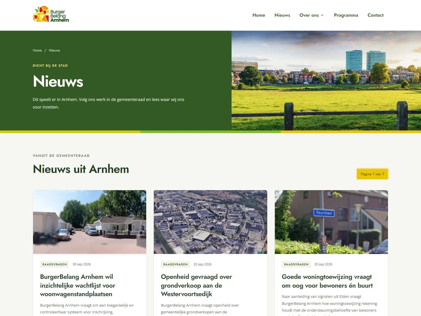
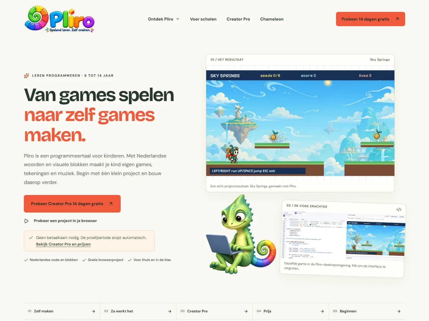
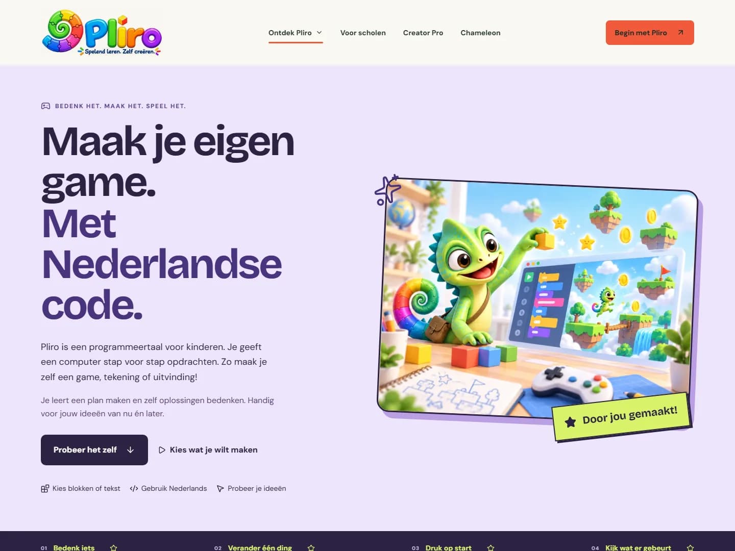
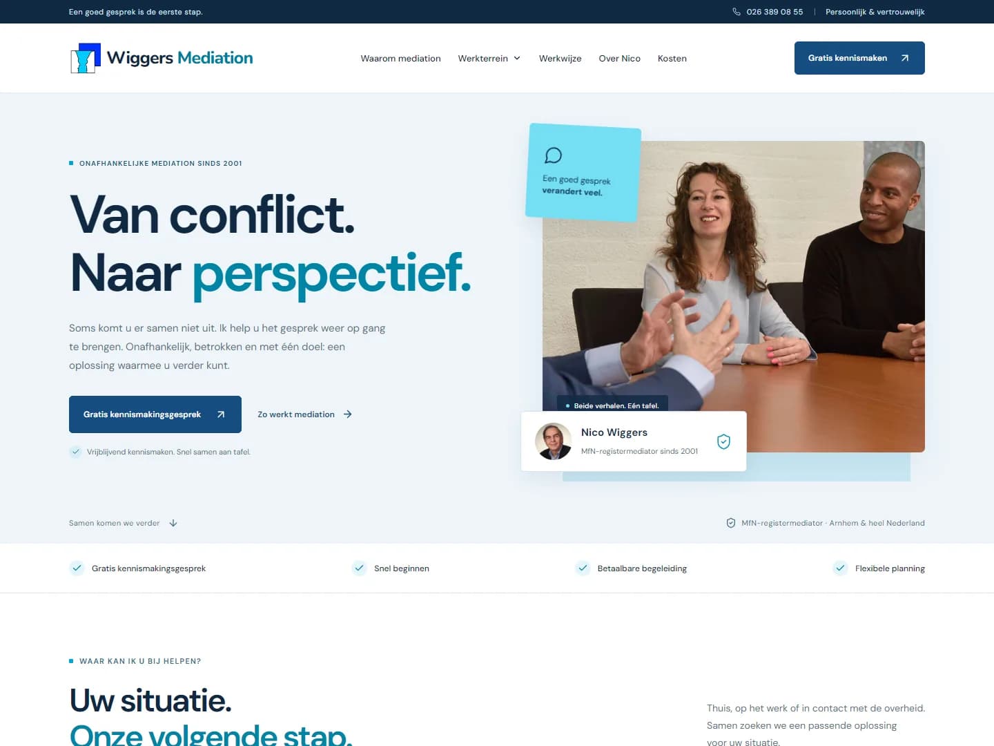
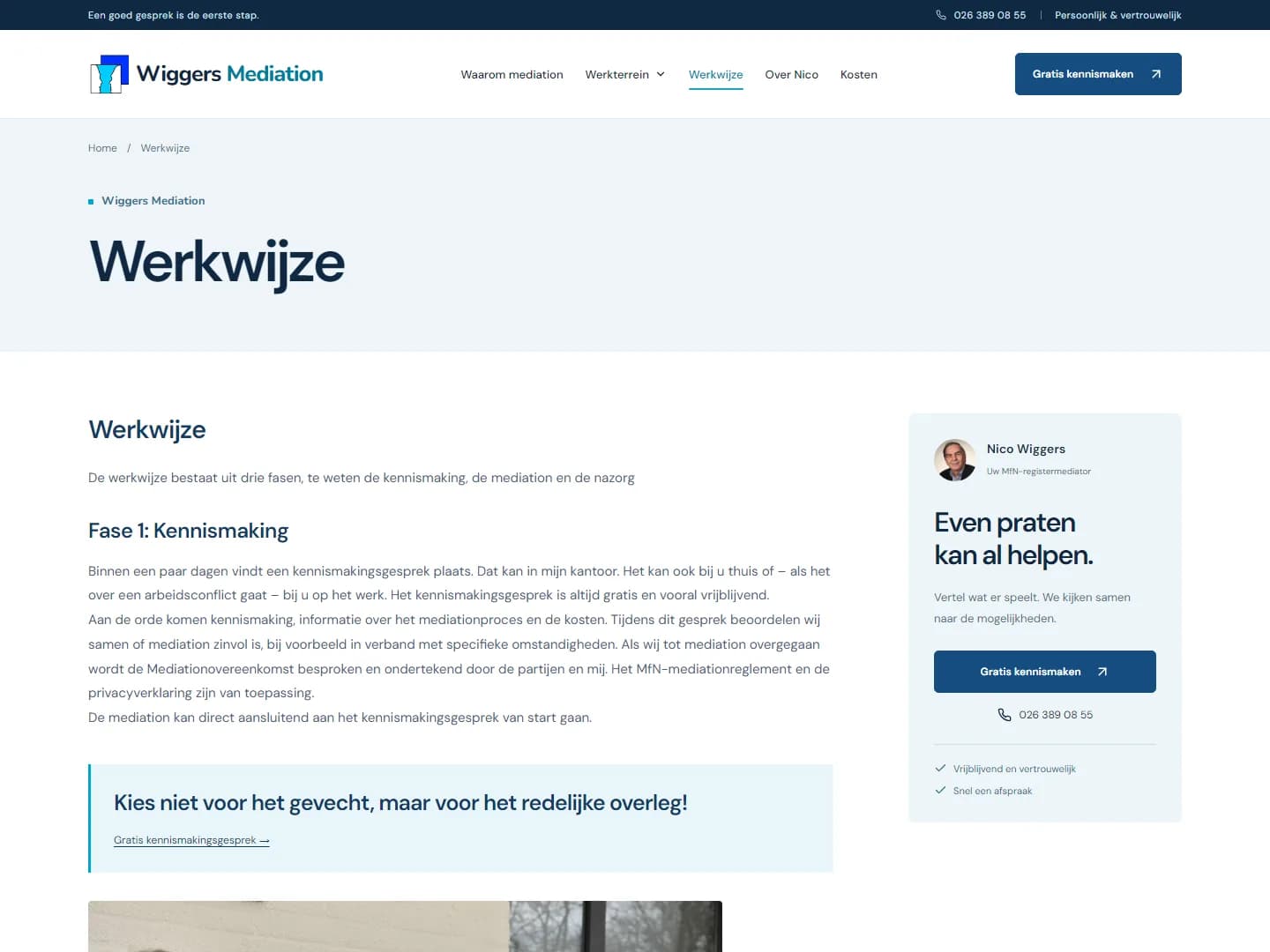
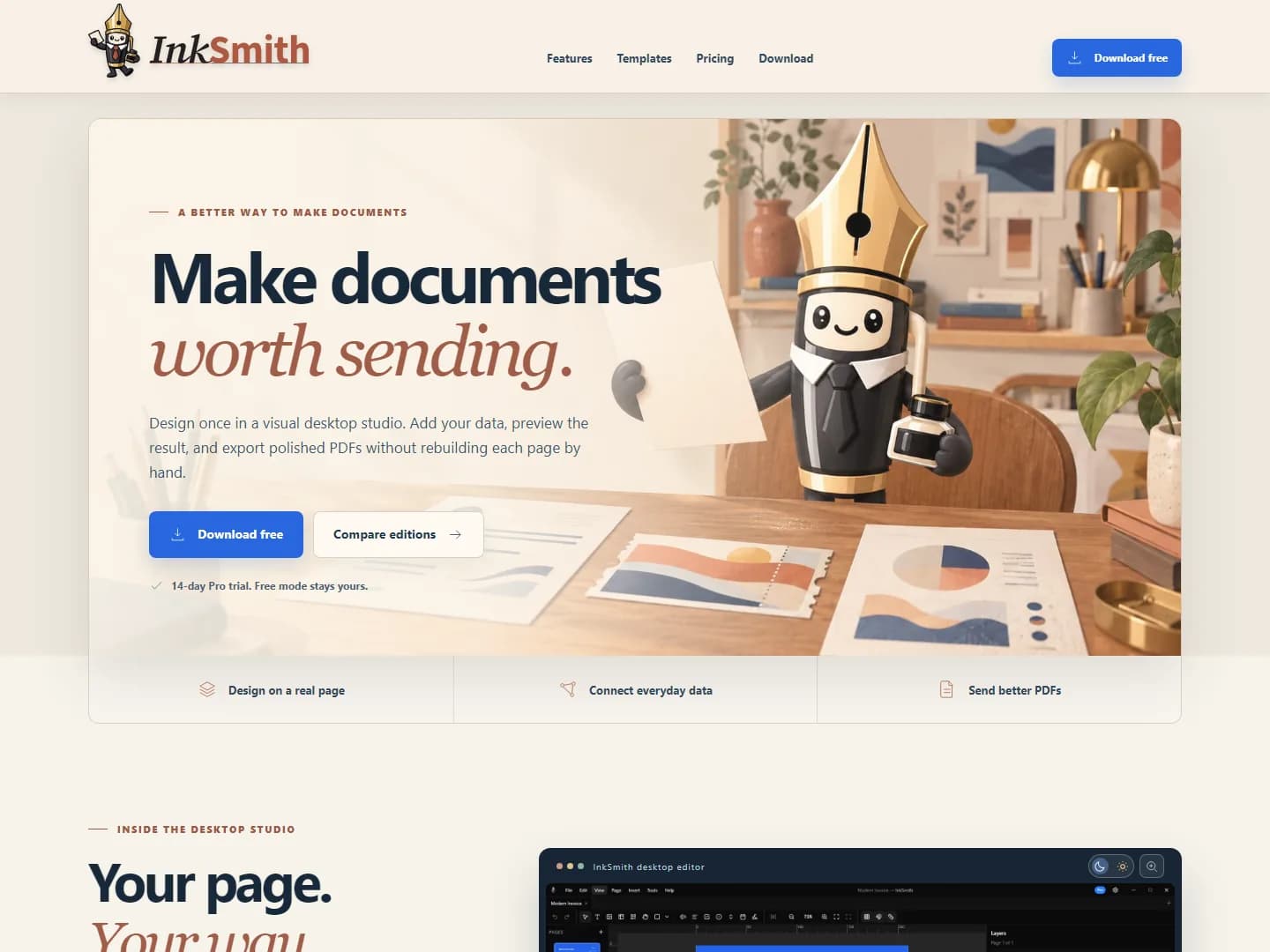
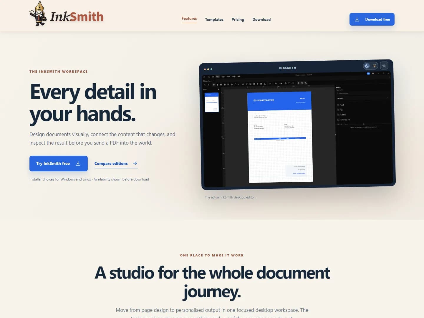
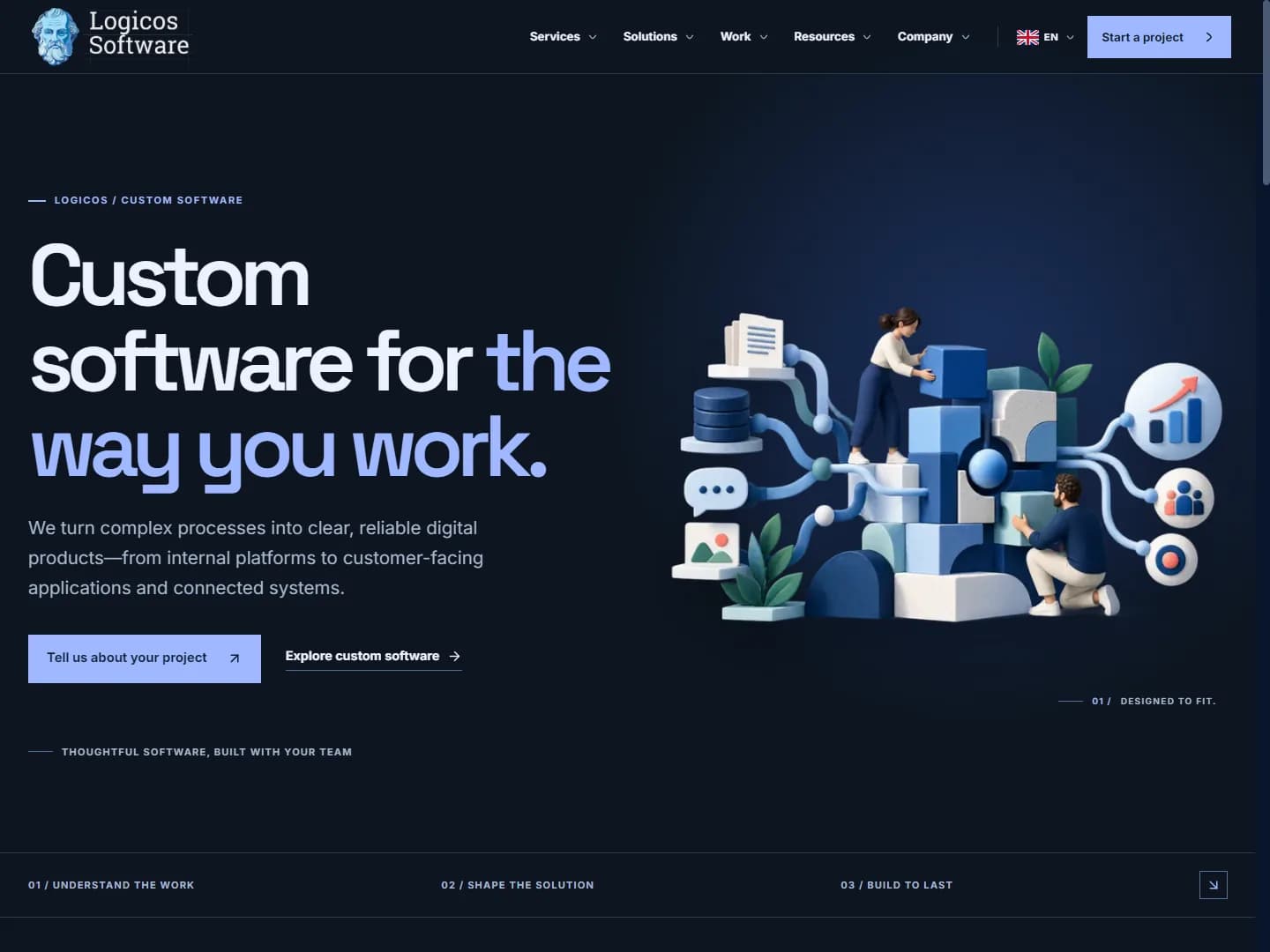
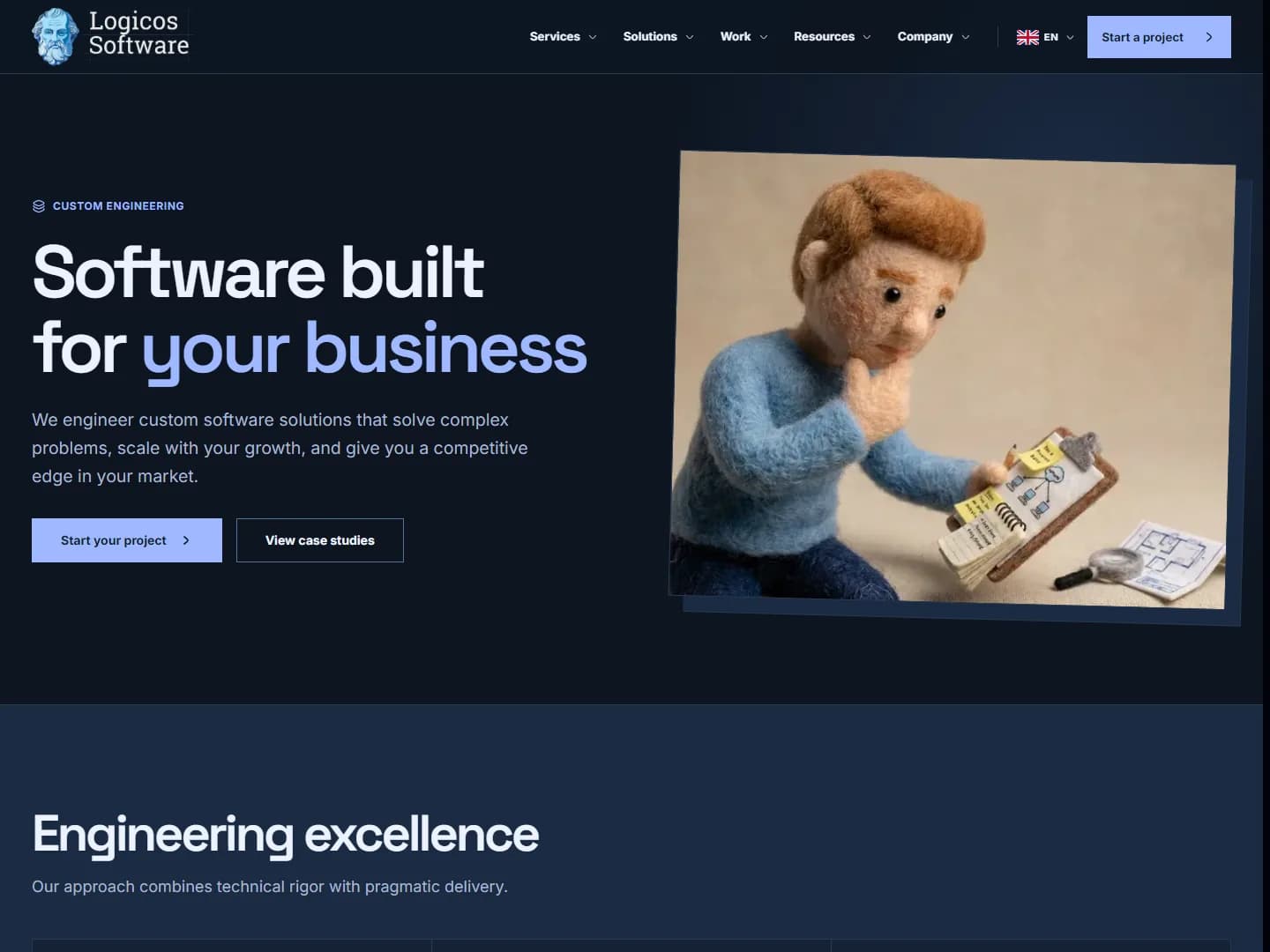
Five websites with stories of their own, from local politics and mediation to creative learning and software.

RESPONSIVE BY DESIGN
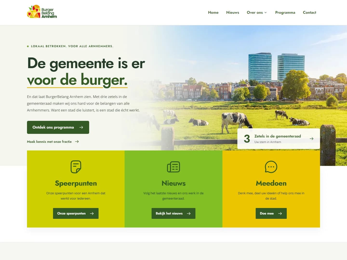
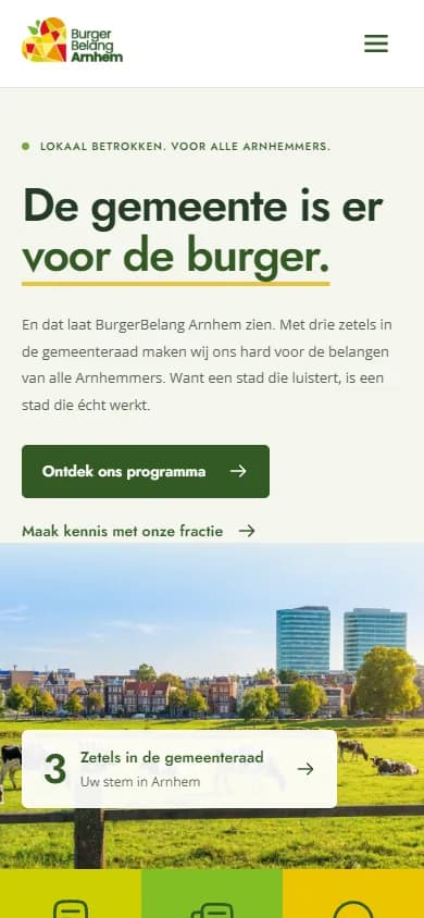
One clear story. Every screen.
A website should keep its hierarchy, personality and next step intact as the screen changes. We design the desktop and mobile experience together.
- 01Content that stays easy to scan
- 02Navigation that fits the device
- 03A clear path to contact
For teams ready to move beyond a template.
We build for teams that need a site to earn its keep — not just look good.
Growing SMBs
You've outgrown a template site and need a credible digital home that generates qualified leads and handles growth.
E-commerce & DTC brands
You sell online and need fast, conversion-focused storefronts with clean product storytelling and frictionless checkout.
Agencies & in-house teams
You need a reliable production partner for client sites or internal tools — white-label friendly, with clean handover.
A website built for the whole journey.
Every website we build is designed around your goals and optimised for results.
Responsive Design
Layouts planned and tested for common screen sizes, from mobile phones to desktops.
Make key content and actions easy to find on smaller screens.
SEO Optimisation
Clear content structure, page metadata and technical foundations to help search engines understand your site.
Give useful pages a better foundation for search visibility.
CMS Integration
Easy-to-use content management so you can update text, images, and pages without a developer.
Keep everyday content updates in your team’s hands.
Performance First
Fast-loading pages with optimised assets, lazy loading, and modern delivery techniques.
Reduce avoidable loading friction for your visitors.
Accessibility
Readable content, keyboard-friendly interactions and accessible patterns considered throughout design.
Help more people use your site with confidence.
Analytics & Tracking
Privacy-friendly analytics integration so you can understand your audience and measure results.
See how visitors use the site so you can decide what to improve next.
What's included, line by line
No surprises. Every project includes these as standard.
- Discovery workshop and content brief
- Custom design system (colours, type, components)
- Staging environment for review and sign-off
- Responsive build, tested on real devices
- SEO basics: meta, sitemap, schema, redirects
- Privacy-friendly analytics (GA4 or Plausible)
- CMS training session and written handover docs
- 30 days of post-launch support included
Want a tailored proposal?
Share your goals and we'll come back with a scope, timeline, and fixed price — usually within one business day.
The approach
From first conversation to launch.
Three clear stages, with room to review, refine and launch with confidence.
- 01
Discovery & Strategy
We learn about your business, audience, and goals to create a design strategy that delivers results.
- 02
Design & Develop
Wireframes, visual design, and development — with review rounds at every stage.
- 03
Test & Launch
Thorough testing across devices and browsers, then a smooth launch with post-launch support.
We agree the timeline with you based on scope, content and feedback.
A website shaped around your goals
From a focused launch to a larger platform. We will shape the right scope together.
Starter Site
A focused one-pager or small marketing site — perfect for a clean launch or refresh.
- Up to 5 pages, fully responsive
- Custom design on your brand
- Basic SEO & analytics setup
- Launch in ~3 weeks
Growth Site
A full marketing website with CMS, built for lead generation and long-term growth.
- Up to 15 pages + blog/news CMS
- Conversion-focused page templates
- Full on-page SEO foundation
- CMS training & handover docs
- 30 days post-launch support
Custom / E-commerce
Bespoke platforms, e-commerce, integrations, or multi-language sites scoped to your goals.
- Shopify / headless commerce
- Multi-language & multi-region
- Custom integrations & APIs
- Ongoing partnership model
Straight answers to the questions we get most often.
How much does a website actually cost?
The cost depends on the scope, content and features your site needs. After a conversation, you will receive a clear proposal with the agreed scope and price.
How long does it take?
A Starter site launches in around 3 weeks; a full Growth site typically takes 5 – 7 weeks from kickoff to go-live. Timeline mostly depends on how quickly content and feedback flow.
Who owns the design and the code?
You do. Once final payment is made, all design files, source code, and accounts are transferred to you. No vendor lock-in, ever.
Do I have to host with you?
No. We'll recommend the best fit (Vercel, Netlify, or your existing host) but you're free to host anywhere. We hand over a deployable build.
Can I update the site myself after launch?
Yes. Every project ships with a friendly CMS and a training session so your team can add pages, edit copy, and swap images without touching code.
What if I need changes after launch?
You get 30 days of free post-launch support for bugs and small tweaks. Beyond that, we offer flexible care plans or work on hourly basis — your choice.
BEYOND THE BROWSER
Need a mobile app too?
We design the user experience and interface, then work with Logicos Software on the path to development.
Ready for a website that converts?
Tell us about your project and we'll create a proposal tailored to your goals — or explore the tools we offer to boost your conversion rates.